 E-commerce · Dunelm · 2022
Fixing a cart
conversion crisis
After a cart redesign launched at the UK's largest homewares retailer, conversion from cart to checkout dropped by 22%. I used GA and ContentSquare to diagnose the problem, formed three hypotheses, and ran a series of multivariant tests that not only restored conversion but exceeded it.
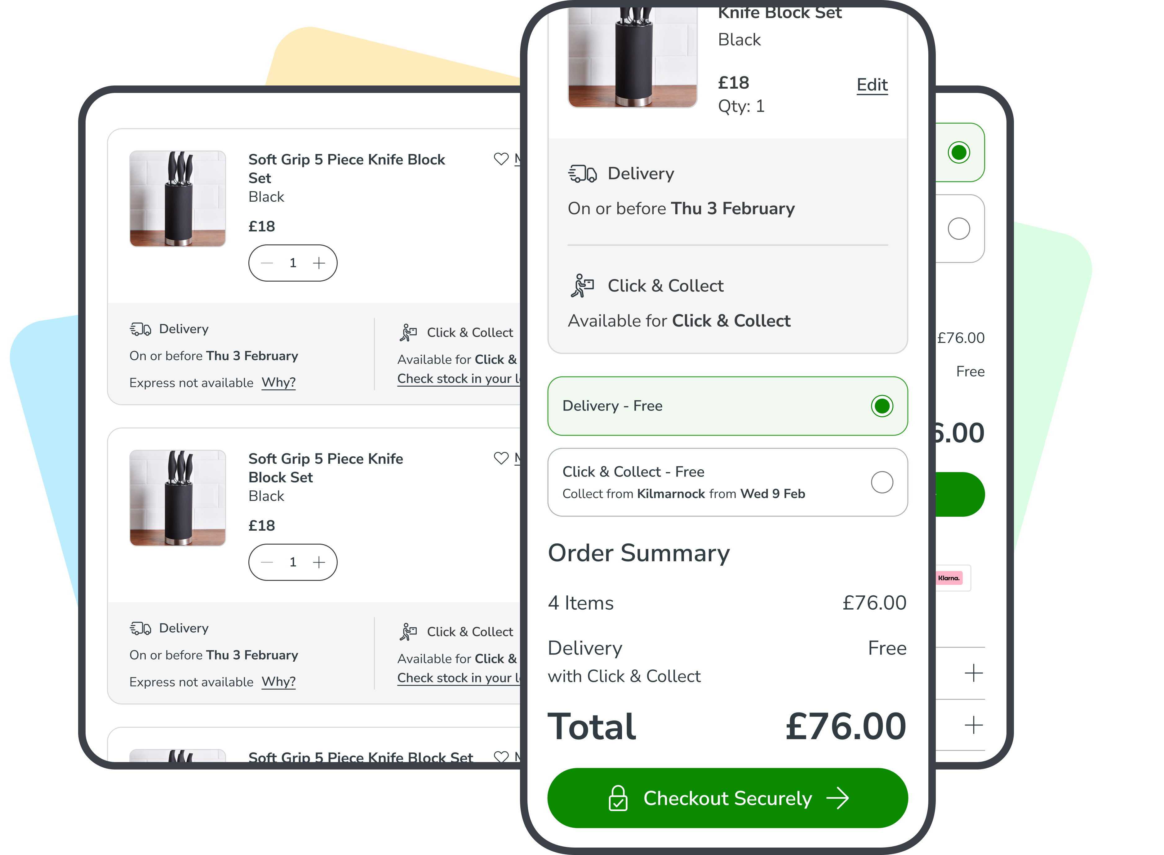
Conversion dropped 22% after a redesign
Dunelm operates over 170 stores across the UK and reported annual revenues of approximately £1.71 billion. As Lead Product Designer on the Cart team, I began analysing analytics data shortly after joining and discovered that cart to checkout conversion was significantly below the target benchmark.
After confirming with engineering that there were no code leaks or technical errors, it was clear the problem was a usability one.
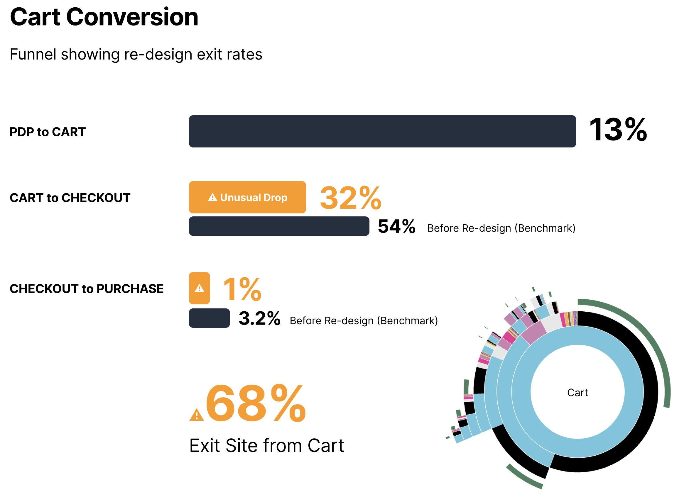
Reading the data before forming opinions
I pulled raw data from GA and ContentSquare to understand performance across the cart page. Once I confirmed there was an additional 22% conversion drop from what was expected, I used ContentSquare to review heatmaps and session recordings of users navigating the cart.
I also ran exit surveys on cart pages and conducted user interviews to understand intent and mental models around fulfilment and checkout.
Three reasons users were not converting
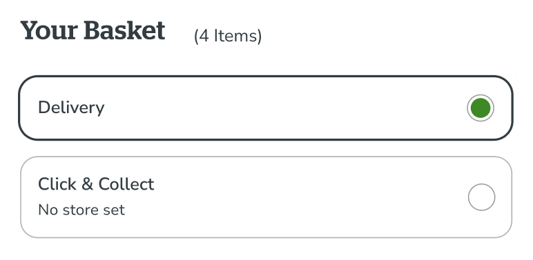
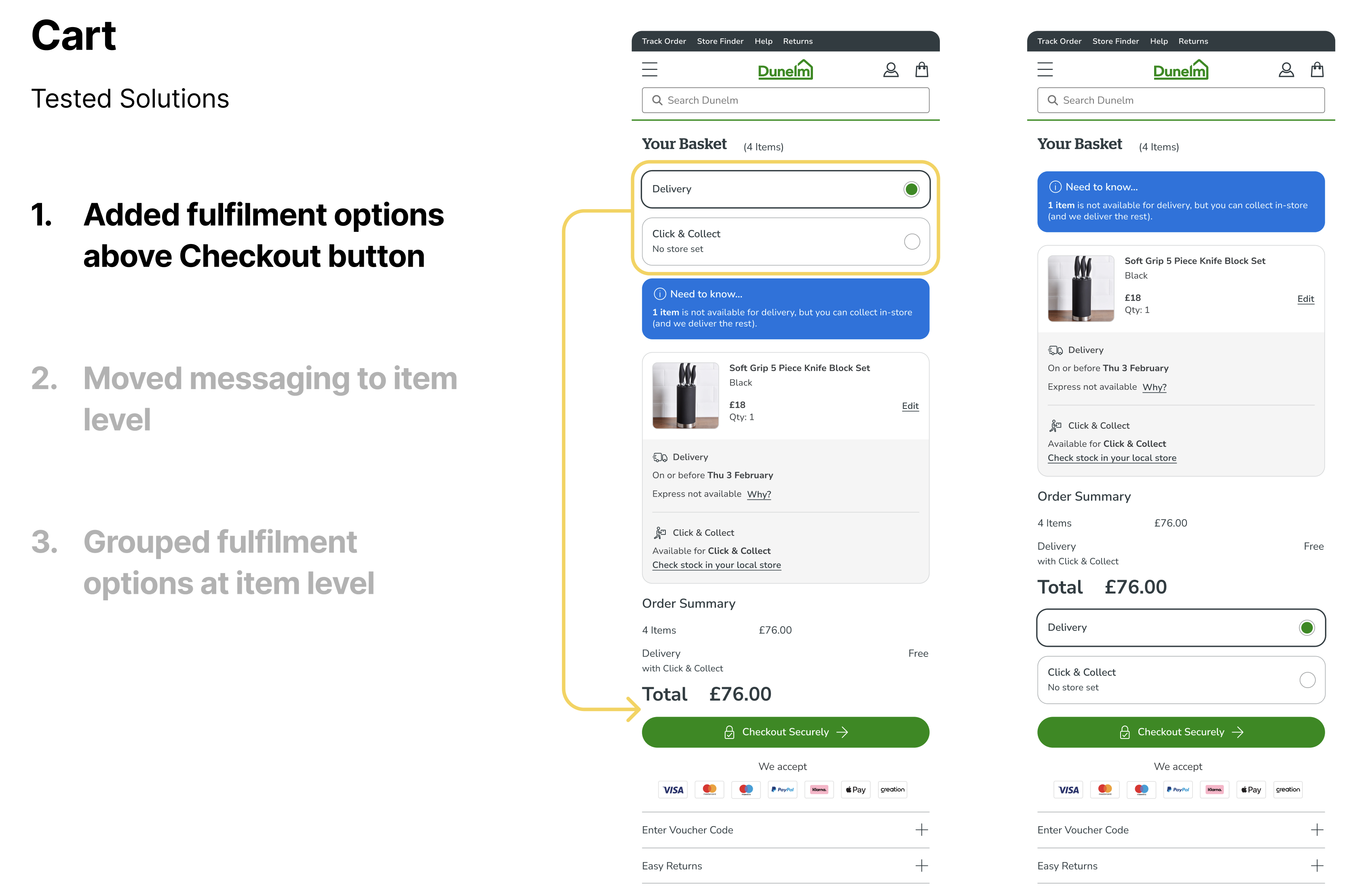
User interviews showed that customers expected fulfilment choices to directly progress them to checkout. The spatial separation was breaking that mental model.
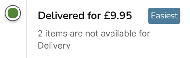
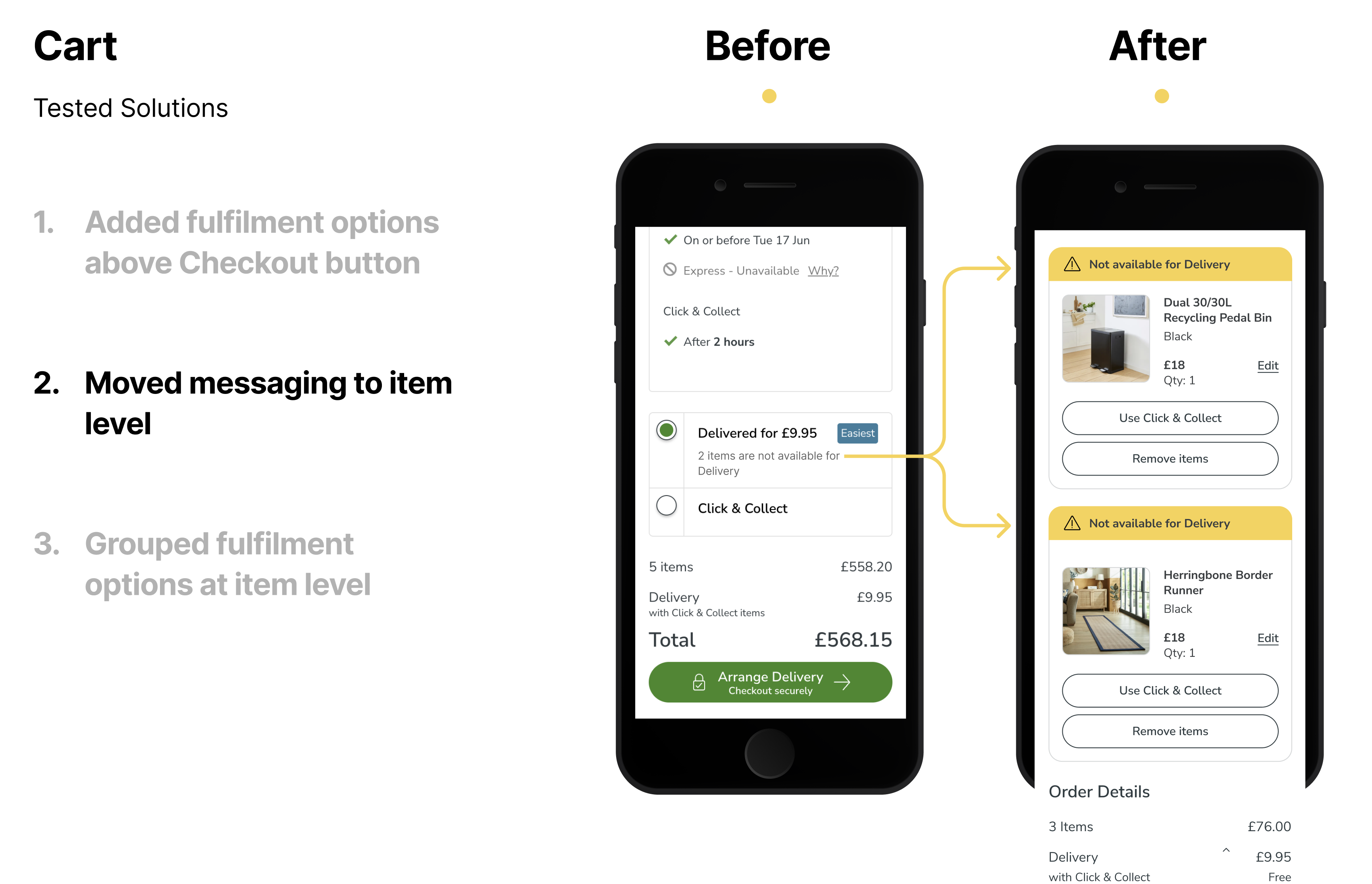
Users found the messaging confusing. It was unclear which items in the cart the message referred to, causing frustration and abandonment.
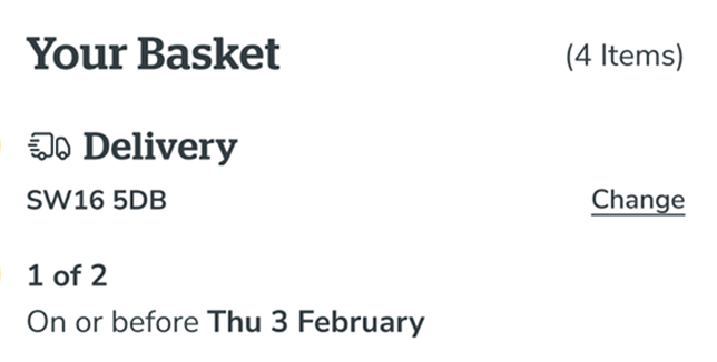
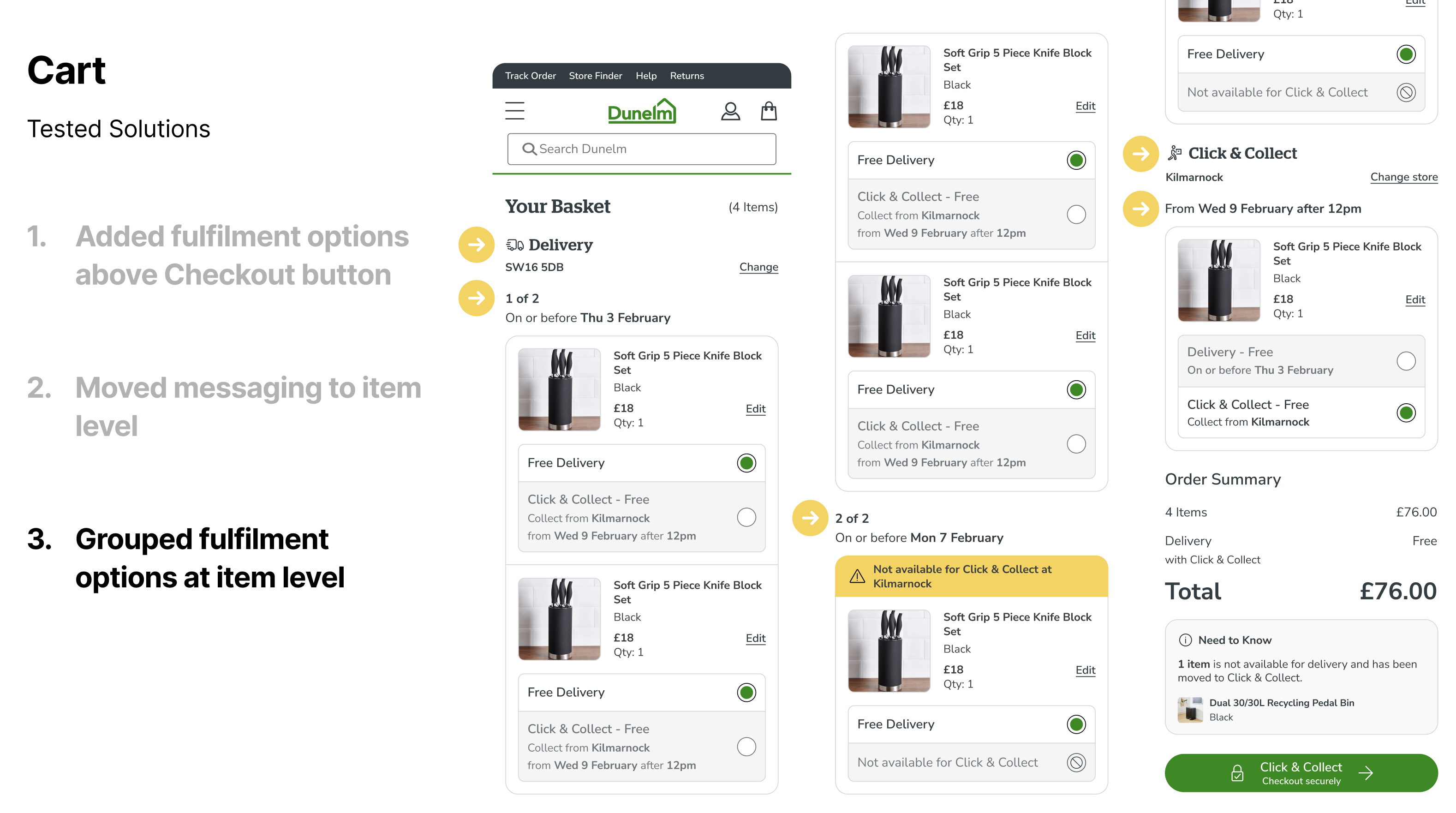
When a cart contained items requiring different fulfilment methods, the global fulfilment selector did not make it clear how each item would be handled.
Testing each hypothesis independently
I validated each proposed solution individually by conducting both moderated and unmoderated usability tests on UT.com, surveys via Lyssna, and a custom analytics funnels I built to isolate each variant. Running the research methods separately ensured I could attribute any change in conversion to a specific intervention.
Conversion restored and exceeded
I released the three variants into production for 50% of customers, split across three challengers at 33% each, measured over one month. I tracked conversion rate to checkout, time on page, average order value, revenue per visitor, bounce rate, pages per session, and return visit behaviour via multi-session cookies.
"I integrated multi-session cookies to track user behaviour across return visits, understanding where they entered the site before landing back on the cart page and where they went afterwards."
Each hypothetical solution was tested in isolation first & then tested ensemble to ensure users were not initially negatively influenced by the other solutions.
Winning variants were introduced sequentially into production with dedicated analytics funnels to confirm each worked individually before introducing the next.
Multi-session cookies allowed behavioural tracking across visits, understanding the full journey not just the session.
Worked alongside engineering to confirm no technical root cause before beginning design investigation.
Want to chat more about this project?
This case study covers the core of the work. I am happy to discuss the user workshop process, team dynamics, design retrospectives, and the detailed research methodology in a conversation.
Send me an invite to chat